Practice Map
A word map of my inspirations, both from life, material and established artists

Week 1
Our first task was to create an artwork from a word we were randomly given.
Restraints:
Time - 15 min
Materials - no mark making allowed, only paper, scissors, glue and tape
Encouraged to create instinctively, not being too literal or planned.

IRONY
my given word was IRONY
materials - green paper with masking tape
Reflection:
I immediately considered the meaning of the word and started forming artistic and visual idea that would convey it. This is my preconceived instinct and it was difficult to ignore. I covered the paper with masking tape and stuck it to the wall, it suggests an artwork that is covered by tape and in peeling off the tape to see the artwork, you would tear the paper and ruin it. Irony.
ACTANT
my given word was ACTANT
materials - white paper
I didn't know the meaning of the word, so I could not immediately think of ways to represent it. This forced me to create differently, instead I repeated the word in my head over and over while letting my hands instinctively manipulate the paper. Because I was directly in contact with the paper, I could create without thought or plans, letting my hands scrunch and fold the paper without too much thought.
I really enjoyed the process as well as the final product, it is an artwork that came from a part of my brain that wasn't analytical.
I like that when installed on the gallery wall, the lighting enhances this artworks form with shadow

Week 2
Using the Adobe Illustrator application on the QUT computers, I created a line and text based artwork.
This artwork's purpose was mainly to experiment with Illustrator and get
Experimenting with shapes, line and text

Week 3
Using the Adobe Illustrator application on the QUT computers, I created a text based artwork focusing on onomatopoeia.
Using the sound from the wobbling projector screen I turned it into typed text, manipulating font and shape to create the composition.
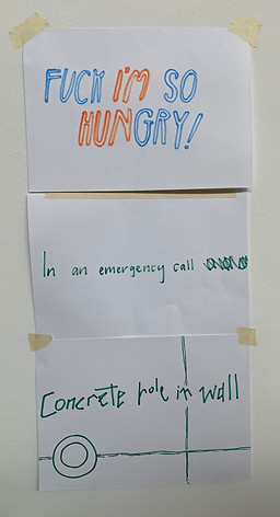
Poem exercise
An in-class exercise in making collaborative haikus.
We were assigned to make a 5 syllable line or a 7 syllable line based on things we saw or experienced on the walk to class.
The separate lines were then put together on a wall, creating a collaborative haiku with no pre-planning.
My line:
"Concrete hole in wall"

Birthday Card - artwork progress
I had the idea for this large scale artwork during a tutorial, it was completed within two days.
An enlarged birthday card made in the style of a ransom note.
The artwork is a perfect recreation of a real birthday car I was given and have since kept under by bed for a number of years.
I wanted to explore the duality of a ransom note and a birthday card, two concepts that immediately draw themes and pre-associations from viewers.
The ransom note is a form of letter that coincides with hostility, bargaining and most importantly for this artwork, anonymity. The strenuous effort to cut and glue each letter or phrase ensures that the author of the letter is unidentifiable.


I had the idea for this large scale artwork during a tutorial, it was completed within two days.
An enlarged birthday card made in the style of a ransom note.
The artwork distorts a real birthday car I was given and have since kept under by bed for a number of years.
I wanted to explore the duality of a ransom note and a birthday card, two concepts that immediately draw themes and pre-associations from viewers.
The ransom note is a form of letter that coincides with hostility, bargaining and most importantly for this artwork, anonymity. The strenuous effort to cut and glue each letter or phrase ensures that the author of the letter is unidentifiable.
Back of the card at the base - date of the origional card

record of exact number of letters in the card
Birthday Card
Finished artwork - Photos and physical card installed in gallery
Official title:
"You wrote me the most beautiful Birthday card,
I wept when I read it,
Did you want that?"
Photos for gallery + additional


Wide shots of full photo shoot area:


Typography Practice
Using stencils and online photo reference to create interesting fonts and designs


POSCA pens on glass with LED lighting strip inside the frame. The lighting allows me to make the text any colour I chose. The pen is easily wiped off so i started by creating guide lines to make the text level and evenly spaced.
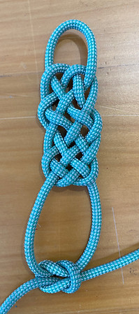
Knotting Practice
Practicing and learning new knots.
These are the main knots I enjoyed making, they vary from having utilitarian use or decorative purposes.
Knots I already know:
- bowline
- reef knot
- clove hitch
- monkey fist
- truckers hitch
- figure of 8
Spindle Fiber Bar
A decorative weave inspired by the cellular behavior called Spidle Fiber

Prosperity knot
made for decorative purposes, originally created in China as an extension of the double coin knot

Monkey Fist
Used for throwing rope across large distances (from boat to dock)

Rope research
History and origins on knot making, as well as how-to tutorials:
Youtube tutorial I used:
Levels of Knot Tying: Easy to Complex | WIRED
Book tutorial I used:
KNOTS Step by Step by Des Pawson
published in 2022 by Dorling Kindersley
Five major types of knots used in my art:
Overhand Knot: a knot turned in on itself to create a loop.
- Bowline
Hitch: a knot used to attach a rope to another object, like a pole.
- Clove hitch
Bend: a knot used to fasten a rope to another rope.
- Sheet bend
- figure of 8
Stopper Knot: used to secure the end of a rope.
- Monkey fist
- Figure of 8
Decorative: for clothing and aesthetics, often used in rituals and cultural traditions.
- Prosperity knot
- Double coin knot
- Spindle Fiber knot
Online research:
https://www.parks.ca.gov/pages/485/files/rope%20making%20station%20revised%203-11-12.pdf
Early uses for ropes:
-
Decorate pottery
-
Move block of stone for buildings
-
Ring church bells
-
Mats
-
Baskets
In Finland, a bowline was found on a fishing net dating from 7,200 BC but it is in Denmark that the oldest sailing knot was discovered. It was a clove hitch found on a 10,000-year-old fishing hook.
Artist Research
Lawrence Weiner
‘Water made it wet’
1998
Lawrence Weiner is a New York artist who works mainly in sign-like text art. Doing window commissions and larger public murals like this gives a certain humor to his work.
The absurdist nature is very similar to David Shrigley while his grand-scale art and self-done photography of said art is a very attractive concept to me.

Window Commission
Brief: vinyl on window, using text only that acknowledges the nature of a double sided artwork (the window making the artwork viewable from both sides)
Dimensions: 880cm x 3cm


I wrote this palindrome because the fact that it reads the same forward and backwards makes it very appealing for a window installation. Like the glass, the phrase can be viewed or read from multiple directions and reflections and remain the same.
"NO DEVIL, I WAS STUCK. RATS... STARK CUTS SAW I LIVED ON"
I also doubled the phrase, flipping it both vertically and horizontally so that it could line up and perfectly mirror itself.
The top image is from outside the building, with the blinds down. The afternoon sun cast a shadow on the blinds inside the window which I was pleasantly surprised by; The extra doubling of text and reflection or refraction only strengthens the text and its multidimensional nature.

The final product was not entirely how I hoped it would turn out: the text is far smaller than ideal due to the width of the window and the length of the phrase. I could have remedied this by curving or re-aligning the words to more suitably fit in the space, however the continual linear format was important to showcase my palindrome and its qualities.
If I repeated this artwork, I would devote more time to finding a solution to the scaling problem, possibly playing with font and length while keeping the phrase on one line.
I am very happy with the palindrome I wrote and also with the overall aesthetics and effect of the doubled and mirrored composition. Elements of the composition compliment the phrase itself and also the brief for this commission, I am very pleased with the final result.
Artist Research
Alex Buchanan uses rope weavings and knots to create impressions on paper (see both monochromatic images to the left).
These pressed weavings inspired me to experiment with printing my knots, this experiment did not achieve the results I wanted nor did it inspire me to continue the practice but it was a worthwhile and interesting endeavor.
After experimenting with rope pressing I moved onto hanging the rope in certain formations, this led to my next artwork, 'Rope Portrait'.
My ink printing using the Prosperity Knot and a lino press:


It's just Knot in the Cards
Carving a piece of Tasmanian Oak that I found in a scrap pile, I attempted to carve a figure of 8 knot.
Over two weeks I slowly chiseled, drilled, sawed and sanded this block down until the thin pieces of rope started to surface and intertwine.
It was largely successful... until it wasn't.
A VERY SAD CARPENTER: THE SHORT STORY


What started great became broken and wounded (the knot and myself) (I have since invested in knife-proof gloves and better quality tools)
The intention for this project was to photograph the finished wooden knot in a sail boat surrounded by rope knots. These photographs would then be comically labelled, much like the photos of John Baldessari (see monochrome photo on left)

Nowhere to Go
Using multiple ropes and the knots I practiced earlier in the semester, I created a self portrait hung on brown paper.
The ropes are pinned to the gallery wall, through the paper.
Final dimensions: 1840cm x 1140cm
Iteration 2: Less writing and in subtle drawing mediums such as pencil and pen only

As I added to the artwork, the writing became more haphazard and personal. I started using charcoal and oil pastels to make messy and aggressive text. The text itself included my personal opinions on the knot and how I would use it.


The writing consists of information about the knot it is surrounding. This includes the name of the knot, it's historical purpose and creation, and occasionally some diagrams explaining how to tie it.
Iteration 3: (FINAL) more writing, colourful and aggressive drawing materials and hand writing.
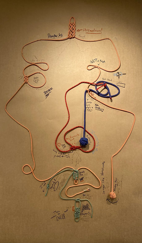


Iteration 1: rope planned out on floor, before text was planned. This version looked much more like my own face, however the final iteration workes well with the restrictions of instellation.

Reflection:
In planning the layout of the ropes, I placed the face initially on the floor, then when pinning it to the wall the added restraints of the brown paper's width and gravity pulling on the rope made the final face look significantly different to my original plan.
The writing also formed very organically, it's chaotic nature forming overtime as I was frustrated and unhappy with the first iteration. This frustration pushed me to try more bold approaches to the text and how it's presence in the portrait could create character and whit. The personal nature of a lot of the text makes the artist have a definite presence and opinion in the art.
I am much more satisfied with the third and final Iteration.

The title 'Nowhere to Go' is a nod towards my thoughts while learning these knots and making the portrait:
The people who invented these knots must have been bloody bored!
Which is true because the sailors who invented many of these were at sea with nothing to do for months at a time.
Rope Boat
By whipping rope together, I created a small cupped shape resembling a boat. On the top rim of the boat I have attempted to stitch "PORT" and "STARBOARD" on the appropriate sides. However, the size of lettering, restrictions with sewing onto rope and the colour of the thread I used all make the lettering incredibly difficult to read. The lettering was not as successful as I would have liked, I could fix this with different coloured thread or simply a different stitching method.
The sculpture started with simple whipping techniques to create a loop in the rope, the rest was simply continuing to coil the rope around itself, selectively raising and lowering certain levels to create the desired shape.


Type writer works
Using a refurbished typewriter, I made a series of artworks that use passages drawn from Samuel Taylor Coleridge's poem, 'The Rime of the Ancient Mariner'. The passages are accompanied with illustrations or imagery relating to that particular passage and my own emotional response to it.
Iteration 2: 'The Albatross'
I used stippling in this iteration to reinforce the image of the Albatross. The same phrase typed to the side is used to fill the shape of the bird. I also used repetition in the typewriter to enhance the line "Who shot him" to mimic the violence the text inferes.

Iteration 1: 'Assorted Phrases'
I collected my favorite phrases from the long poem and practiced using the spacing of the typewriter. I also experimented with ink weight and punctuation.


Iteration 3: 'The Albatross Part III'
Phrase - "Instead of the cross, the Albatross around my neck was hung"
The accompanying illustration is a top-down view of an Albatross in flight, made with fin-line pen stippling.
The spacing on the typewriter didn't behave as I excepted on the vertical line, however I enjoyed the result, the vertical line is now very dense and relatively illegible.
I intended the formation to look like a cross, but because the vertical line was so much more condensed then I expected, it looks like an upside-down cross.

Iteration 4: 'The Albatross Part IV'
Phrase - "We were the first that ever burst into that silent sea"
I paired this with a typed silhouette of a traditional tall ship, defining the boat with fine-line pen stippling.

Iteration 5: 'The Albatross Part II'
Phrase - "Swiftly, swiftly flew the ship, Yet she sailed softly too: Sweetly, sweetly blew the breeze, on me alone it blew."
With this iteration I challenged myself not to use pen stippling to define the image. I also inverted my previous approach (filling the silhouette with the chosen typed phrase) and instead used the type writer to fill the background and leave negative space in the center in the shape of a standing person.
The person is not as clear as I would like but it is a decent outcome for my early attempts at type writer imagery.
_edited.jpg)
Turn Left in 300m
1840 x 1140 cm
Nautical chart, Rime of the Ancient Mariner by Samuel Taylor Coleridge, fine liner pen (0.02, 0.005 and 8.0)
Iteration 2 (Final): 'Turn Left in 300m'
The words of the famous poem, 'Rime of the Ancient Mariner', are written in place of the topographical lines on this chart. While writing them out I spun the paper and myself around and around to ensure a consistent size and font of the lettering. The thinner lines depict longitude and latitude lines, as well as the magnetic deviation indicators, sectioning boxes, water current indicators, and a boarder which the poem often exceeds.
I chose the title in an attempt to make my intended meaning more prominent; the artwork combines the two major historical methods of communication used for travel and journey: visual imagery such as maps and charts, and verbal story telling or song.
In the modern day I often feel like travel and journey have become monotonous tasks that are only seen as an inconvenience or mindless ritual, even going between countries has become a matter of hours on a plane where you occupy your thoughts with a movie until you get to the desired location. Because travel and journey used to be such time consuming and dangerous endeavors, they were far more meaningful and facilitated great self reflection and discovery. I want modern day travel to have the same wonderous and romantic effects, however I find myself mindlessly following the blue dot on my phone maps where ever I go, not noticing the world around me. Hence the title of this artwork simulating the Siri voice command that accompanies modern day digital maps. The juxtaposition between a traditional and aesthetic map, and the underwhelming voice command in the title hopefully inspires viewers to consider how we undervalue journey.
The art of map making and especially chart making has become rather redundant with satellite imagery and other GPS technology. This doesn't have to mean that the adventure of geographic journey is lost; there is plenty of whimsical and poetic adventure to be had with modern travel if we give it the time and attention it deserves.
The use of a nautical chart as the base for this artwork was very effective in highlighting the lost art of journey: when asking my peers to review the work, none of them could identify it as a nautical chart or read the navigational symbols it offers.

Iteration 1: Testing paper
To test the appropriate pen type and size, as well as font and general aesthetics, I made a small mock up of the map.
The Artline pen bled when water was applied, whereas the micron pen stayed perfect, the only issue was the pen thickness. I bought a 0.02 and a 0.005 micron pen for the final artwork and it was perfect.

Artwork installed with base curved up: this allows the chart to become an object rather than a separated artwork. It is a functional chart and viewers should consider it as such.

Close up of upper middle island on final iteration

Close up of lower middle island
Iteration 3: DIGITAL MOCK UP
This is a potential third iteration of this artwork that I considered making. With watercolour paints I would transpose the iconography from the phone screen of apple maps onto the traditional chart.
The medium choice of watercolour means that the original map would still be visible through the semi translucent paint.
Progress Photos
Using my window as a light box to transfer original chart - Progress of the pen writing


Drawings
Cattle and Cain
1840 x 1140 cm
graphite and watercolour pencil
lyrics from the song 'Cattle and Cain' by The Go Betweens
self portrait from a mirror with surrounding squiggles drawn with my non-dominant hand.
This was drawn while the named song played, the particular line that I put into the drawing is in the bridge of the song, it is my favorite line.

Miro's Moth
1840 x 1140 cm
graphite and watercolour pencil
I experimented with merging a friend's name into an animal I associate him with. To create somewhat of a logo, I played with the structure of a moth and the letters in his name.
In the lower photo I tried manipulating the letters 'M' and 'T' to create the lower part of the moth and its inner-wing detailing. In a later version, I tried using the letters as decoration rather than structure.


Charlotte's Teriffic Web
1840 x 1140 cm
Cartridge paper, Baking paper, graphite pencil and pen
Using reference photos from the original Charlotte's Web book I made a collaged diptych. The book was given to me by my Grandmother when I was 10, the writing in Charlottes spider web fascinates me. The jutted and fractured nature of the words she writes in her web is very interesting to re-create.
In later iterations I would like to play with putting my own words in her web, experimenting with twisting or personalising the original story.

The First Albatross
1840 x 1140 cm
pencil on paper
This drawing later inspired my artwork with the Typewriter: 'The Albatross Part I-IV'
It has an excerpt from the poem 'Rime of the Ancient Mariner', a piece of literature that I have explored in many artworks this semester.
This drawing was made very soon after my first reading of the poem, it incorporates one of the lines that really stood out to me.
I edited the drawing after I'd finished it, changing the font of the last two lines. This was an effort to add drama and impact. My font attempted to mirror the violence in the words.

The Fading
1840 x 1140 cm
Pen and pencil on paper
This is a drawing using stippling and a fine line pen. It includes a quote from the song 'The Fading' by Joan Shelley, The images are a response to the song. I listen to The Fading while drawing this, trying to be mindful of the lyrics, the instruments and my own calmness. I decided to leave my pencil sketch there, even though they were drawn as guidelines and meant to be rubbed out.

Watch Me Unfurl
1840 x 1140 cm
Cartridge paper, graphite pencil and pen, pressed flower
Using reference photos from the day I was born (left) and a fern frond from my Grandmothers garden, I made a diptych which suggests the progression of time. I often put the date and time on my drawings, in this particular drawing I put the date each photo was taken instead of accurately documenting when the drawing was made.

Knot a Knot
Iteration 1
1840 x 1140 cm
Pen on paper
These drawing were mock ups for a larger idea; I was thinking about doing a series of knot drawings and labelling them as either not the correct name or something attaining to their use. I ended up using physical knots to make the 'Rope Portrait' instead of this idea, however the practice drawings are quite attractive and certainly something I could use in the future.
I used only line to create tone and shape which was very effective in making a stylised knot image.
I wish I had included the time and date that I made this drawing, then it would have matched iteration 2 better and shown progression of time.
(I drew iteration 2 sometime in the in early April 2024)
Knot a Knot
Iteration 2
1840 x 1140 cm
Pen on paper
In this particular iteration I included the date and time that i made the drawing, I made the bowline drawing (see iteration 1) was drawn much later as a result of me finding this older drawing and coming back to it's aesthetics.


Jean-Michel Basquiat
"Undiscovered Genius"
1983
142.2 × 193 cm
screen-print
Basquiat uses his compositions to question his own identity amidst the flush of modern pop culture. Specifically, he investigates cultural self-definition in the modern media-based world.
-
Instinctive
-
Gestural
-
Collage
-
Central Figure
-
Self corrections visible
-
artist's hand visible
-
pop-culture & iconography

Jorinde Voigt
Superpassion
2013
210 x 140 cm
ink, graphite, gold leaf, pastels, oil chalks on paper
"Music allows emotions to grow into structures"
Jorinde Voigt creates lively visual compositions with abstract shapes and bright colours to create a physical representation of classical music
-
Abstract shapes
-
Thin line work that isn't immediately visible
-
Upon closer inspection, the thin linework exaggerates and compliments the abstract shapes
-
The artwork is almost documentative of the colours shapes, suggested by the notes and labels throughout the artwork and the lengthy didactic in the bottom right corner.
https://jorindevoigt.com/works/niklas-luhmann-liebe-als-passion-xxii-superpassion-2013/

Larissa Fassler
Kotti (revisited)
2014
157 x 160 cm
Fine art print
Fassler charts her own presence in the spaces, valuing the experiential process as a vital part to depicting the "failed urban planning".
-
Layering
-
Lines
-
3D graphics
-
Diagram
-
Visual chaos
-
neon colors highlight the central focus
-
Graffiti and pop-culture iconography
